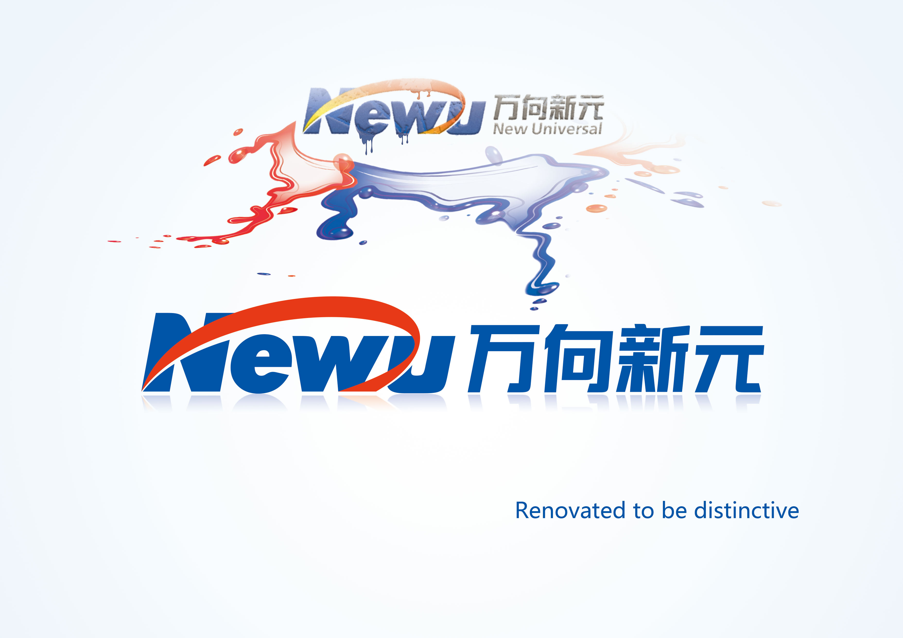
The NEWU’s LOGO is renovated now.
The new logo derives from the NEWU’s traditional one. The pure red takes the place of the ribbon shading from red to yellow. It stands for our infinite energy and passion. The English words, “New Universal”, are removed. Instead, the Chinese words, “万向新元”, is rendered in accordance with main part, in blue, which looks more distinct and more high-tech. This emblems our professional attitudes towards technology.
The new logo is simple and elegant. It disseminates NEWU’s charm in science and technology, but also demonstrates the 14 years’ progress, achievements and culture. Now NEWU has moved onto a new stage, which is our honor. And we will still be humble, making more efforts to realize the Industry 4.0.
京ICP备05048247号 版权所有 北京万向新元科技有限公司 E-mail
